|
The Mobile Site feature is very simple to use and can be turned on in just a few clicks. When turned on, your website will display a mobile version to mobile users and the desktop version to desktop users - you will not need to maintain multiple versions of your content.
How to enable your Mobile Site
- Navigate to Edit Site > Design > Mobile Site.
- Click the checkbox next to 'Check to enable the mobile version of your website'.
- Enter a title in the Branding field. This will be used in the header of your mobile website.
- Click Save.
The majority of your website content will be mobile-ready by default, but certain content on your website may require modifications in order to ensure your website looks great on mobile devices. We recommend reviewing the rest of this article if you intend to use the mobile website feature.
Images
By default, images inserted into the body of your website via the Image button in the Easy Editor are not responsive. There are two easy ways to ensure that your images are optimized properly for mobile devices:
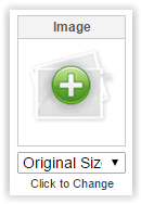
- Use the 'Click to Change' image boxes.
Many page types and Web Page layouts include 'Click to Change' image boxes where you can insert your images. Any image inserted through this tool is automatically set to be responsive.
- Add the "img-responsive" class to your images.
For existing images inserted via the Easy Editor, or for images on page types that do not include 'Click to Change' image boxes, you can add a simple class declaration to ensure they act responsively. To do this, click on the image you would like to make responsive and click on the Image button.

In the Image Properties popup window, click the "Advanced" tab.

In the field "Stylesheet Classes", enter the class "img-responsive" without quotes. In the field "Style", if there is an existing height and weight, delete it from the field.
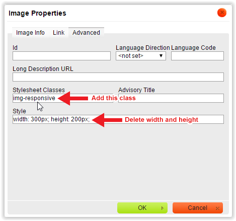
Click OK to apply the change. This image will now act responsively on mobile devices.
Tables and Layout
It is not uncommon to use tables to organize information on your website, but this causes problems when viewing on mobile devices because tables do not act responsively. If you are using tables on your website for layout purposes, you may experience problems with horizontal scrolling as they will not automatically resize for mobile devices.
We highly recommend that you use our Web Page Layouts instead of tables to lay out your content. The Web Page page type includes 26 different content layouts, including a variety of multi-column layouts and layouts with Click to Change image boxes. Many of these layouts will allow you to replicate an existing table layout without using tables, and all 26 layouts are automatically responsive and mobile-friendly.
To select a layout, first edit your Web Page. In the menu on the left, select 'Change Layout' and select the layout of your choice.

Many of the layouts allow you to customize further by setting the width of columns and adjusting the spacing.

JavaScript and Other 3rd Party Scripts
Many of our customers use 3rd party services integrated with their website, such as JavaScript elements, social media buttons, or other external content that relies on scripts not provided by us. As we have no control over these external elements, we cannot guarantee that they will be supported on mobile and cannot assist in troubleshooting.
Flash
Flash content is not supported on most mobile devices. We recommend using non-flash video types such as MPEG4 or embedding video content via a streaming service like YouTube or Vimeo.
Phone Numbers
Most mobile devices will automatically add links to phone numbers written these formats, so that users browsing on mobile phones can simply click the numbers to call:
- (555) 555-5555
- 555 555 5555
- 555.555.5555
It is also possible to manually add links to phone numbers that do not display automatically. To do this, create a link as normal in the Easy Editor. In the "Protocol" dropdown box, select "other". In the URL field, enter your phone number in the following format:
tel:555-555-5555
Click OK to save the link, and you will now have a link that functions as a click-to-call button when accessed from mobile phones.
Frequently Asked Questions
- Can I edit my website on a mobile device?
At this time we are not releasing a mobile website editor. As always, you can log in to your account as normal on a mobile device, but the editor interface is not mobile optimized.
- Why isn't my footer showing up on mobile?
In order to ensure readability and proper formatting, site-wide footers are disabled on mobile websites.
- Why aren't my images responsive?
By default, images inserted into your website via the Easy Editor are not responsive. Please scroll up to the Images section in this article for details on how to make all of your images responsive.
- Why is my layout not responsive?
The Mobile Site feature is turned off by default in order to allow you an opportunity to review your content before enabling the feature. To turn on the Mobile Site feature, navigate to Edit Site > Design > Mobile Site. Click the checkbox to turn on your Mobile Site, and click Save. The text you enter in the Branding field will be displayed in the header of your mobile site.
- I've turned on my Mobile Site, but it's not showing up on my mobile device.
If you are managing your own DNS servers for your domain, you may not be able to see your mobile site because we use an "m.yourdomain.com" subdomain to denote your mobile site. For instructions on how to set up the mobile subdomain with your domain provider, please contact our support team.
- Why isn't my shopping cart/checkout page responsive?
In order to ensure that your cart is safe and secure for your visitors, they will be redirected to the secure desktop version of your checkout to complete their purchase. Mobile users will see a notice when proceeding to checkout to inform them that they will be redirected to the standard checkout page.
- Can I change the way my mobile site template looks?
At this time, your mobile website will be assigned a default mobile template which is not modifiable. This is done to ensure that your website is properly optimized for a wide variety of different mobile devices and screen sizes.
| 
